
Major search engines have started favoring mobile-friendly websites and mobile user experience has become the next most important thing in web design and development. Over the course of the last couple of years, responsive web design has evolved rapidly, causing even the most experienced web designers to lose track of the best practices. Best 4 Things to Keep in Mind When Designing a Website for Mobile Devices.
Contact professional experienced engineers for mobile app development Austin to help you upgrade your existing applications to get an edge over the competition.
Since there are a lot of new trends emerging, we have decided to help you stay on track. Instead of focusing on actionable tips, we have decided to provide you with a more evergreen piece of advice. We’ve put together a list of 4 things to keep in mind when designing a website for mobile users.
Why Should You Focus on Designing for Mobile Devices
Let’s go through some numbers to help you understand the importance of responsive web design. First of all, there are 3.7 million unique mobile users. More importantly, 50% of web page views worldwide originate from mobile phones. When it comes to the mobile subscription penetration rate, The Americas stand at 79%, while Europe stands at 77%. As we speak, more and more people are starting to consume online content via their mobile devices.
Responsive web design will provide you with the following benefits:
- A responsive website will be automatically ranked higher in SERPs.
- The web pages will load significantly faster on mobile devices.
- By providing a delightful user experience you will significantly reduce bounce rates.
- By delivering consistent user experience across multiple platforms, you will increase conversion rates.
Feel free to learn about other advantages of responsive web design.
Design For the Future
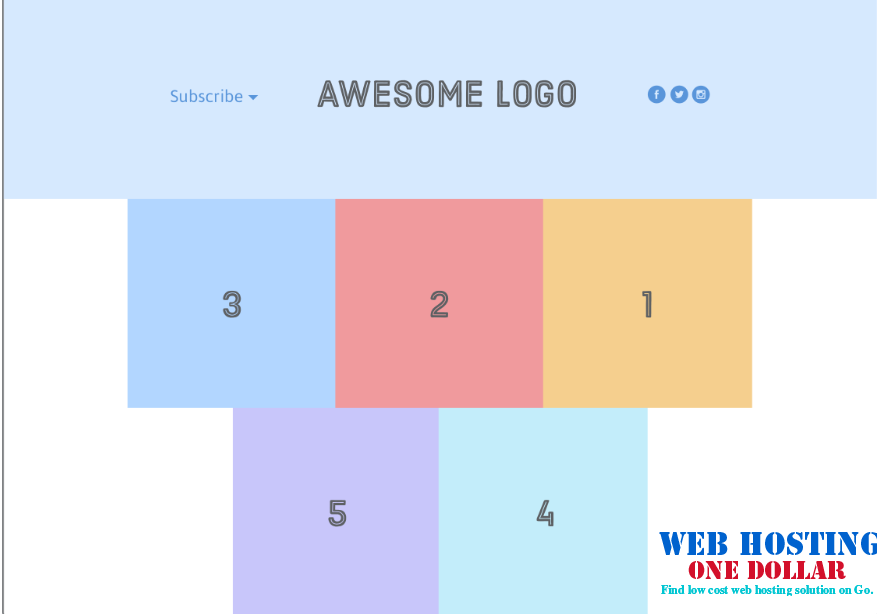
Some web designers use the term responsive web design as a synonym for flexible layouts and fluid grids. If you are wondering why, the answer is very simple – by incorporating flexible layouts and fluid grids in website design, one can easily make quick adjustments in the future without disturbing the user experience.
If you design a website in this fashion, you will be able to easily switch the elements in your layout without having to address scaling issues. If you want to become a master in responsive web design, forget about fixed widths and heights. Design for a fluid grid and your website will stay flexible and scalable.
More importantly, you design will be consistent, in terms of proportion and spacing, no matter the size of the screen it is viewed on.
Pick Your Fonts Carefully
Typefaces are a very important part of the user experience. If you don’t consider your options carefully for each viewport, you can easily end up delivering inconsistent designs. This is why we suggest you take some time to study responsive typography.
The main role of typography is to help the readers focus on the content and immerse themselves in the experience. The typography you choose has to make the text easy to read, and it should also be able to convey the emotion that you want it to convey.
There are 4 things that you always have to pay attention to:
- Font family – this property will help you convey the intended emotion
- Font size
- Line height
- Text width – the last three properties dictate text readability
The responsive typography is a really complex field. Due to the nature of this article, we are not able to share the current best practices as it would eat up too much space. But, if you are interested, you can learn all about it here.
Design Easy to Use Navigation and Menus
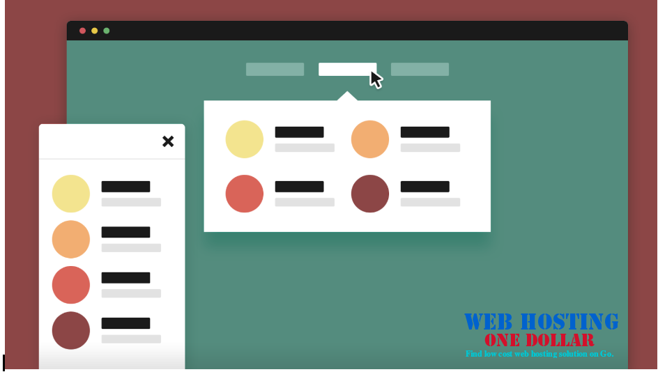
The next on the list is the functionality of your website. Menus and navigation are the things that help your users navigate through the website. What is your goal here as a designer?
You have to do your best to preserve functionality on all screen sizes, and incorporate it in the design so that it doesn’t affect the visual appeal of your design.
It may sound like mission impossible, but thanks to hamburger menus, you can pull this off quite easily. There is one thing that you should keep in mind – don’t design menus that are complex to use. Make it possible for users to get where they want in 1 or 2 taps on the screen if you want to improve the user experience and reduce the bounce rate.
Design the Typing Experience
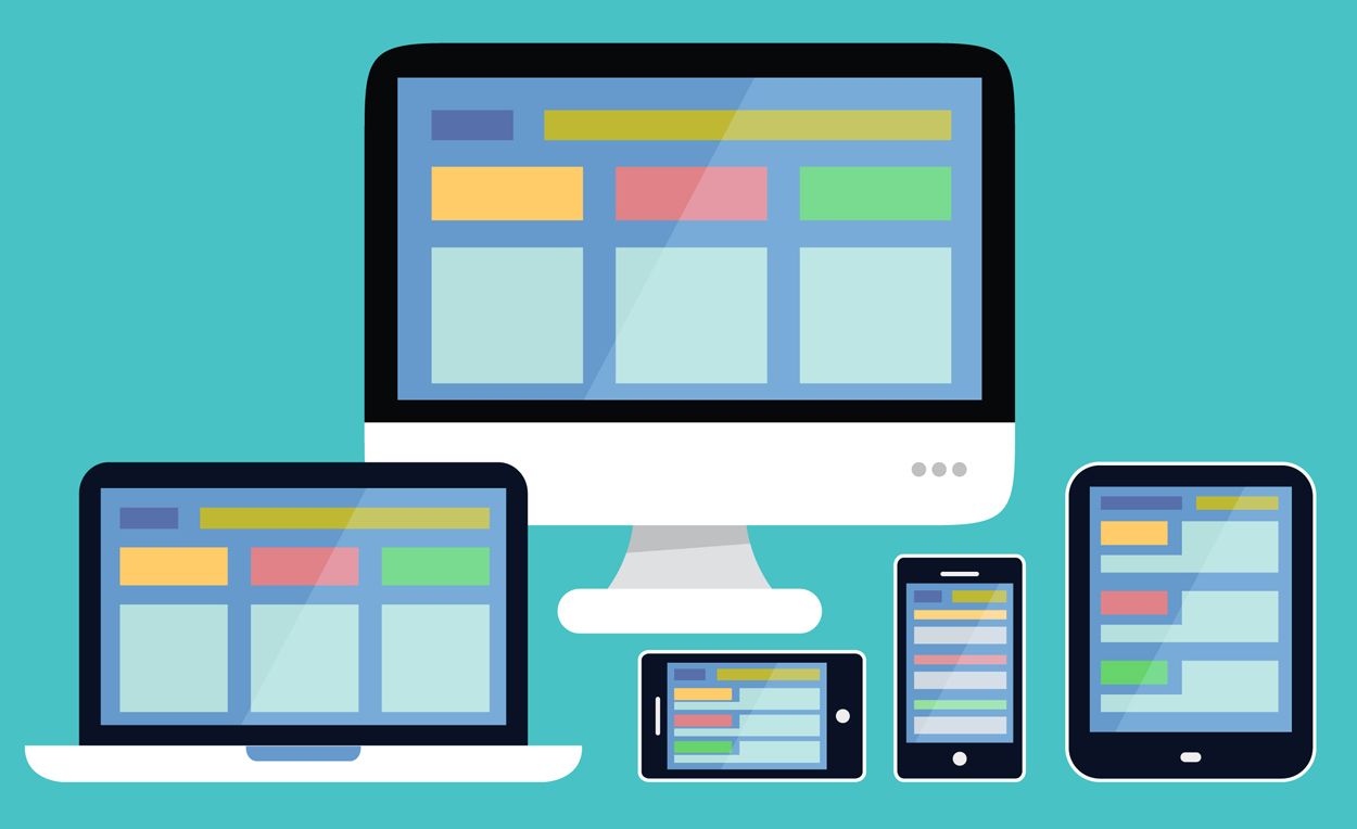
Image credit: benkaminski.com
Most websites have contact forms and comment sections below the blog posts. You will have to readdress these elements and make them optimized for mobile users. Why? Because typing on a small phone keyboard and filling long forms is an excruciating experience for mobile users.
What’s the secret of good responsive forms? They have significantly fewer fields, use pre-fill fields with defaults whenever possible, and have autofill enabled. Whenever you are designing a form, ask yourself – is there anything I can do to make it easier for the user? Perhaps a calendar drops down is a better option than users having to type in the date manually.
Here is a great guide on how to create amazing forms on Android, that you can easily transfer to web design.
With these 4 tips when designing for mobile devices, you will be able to deliver great designs that are not only user-friendly but also easy to edit and update. If you would like to learn more about responsive design, feel free to continue your search online.

